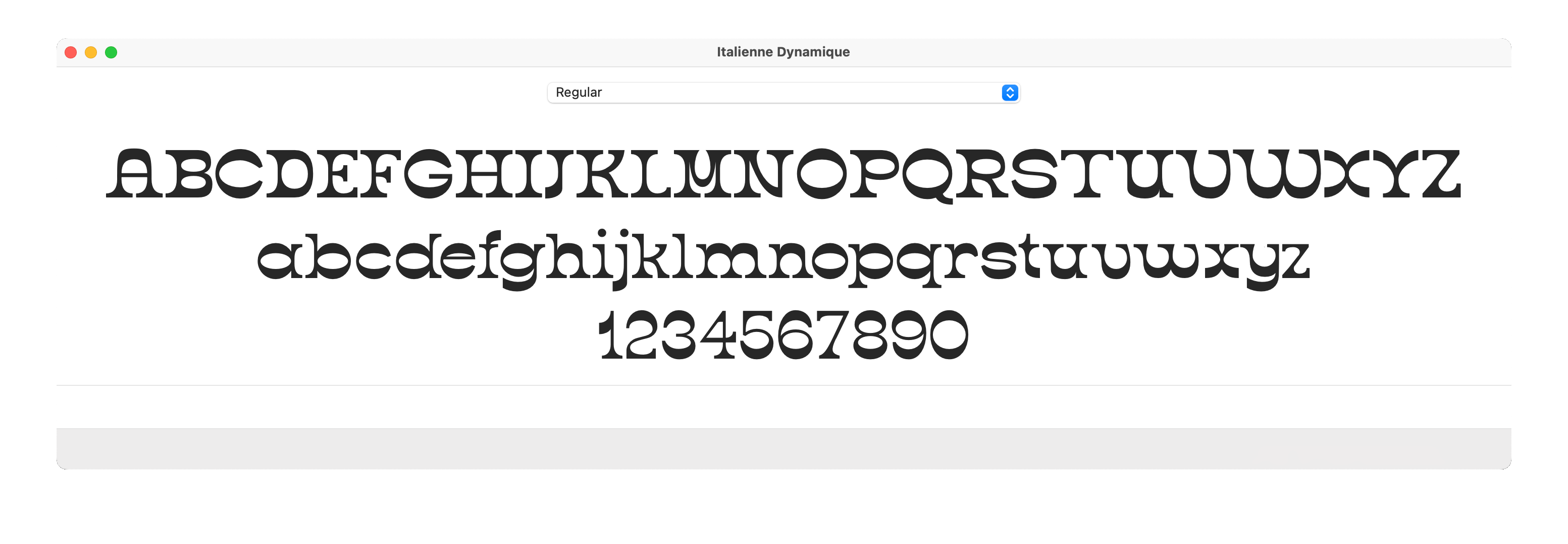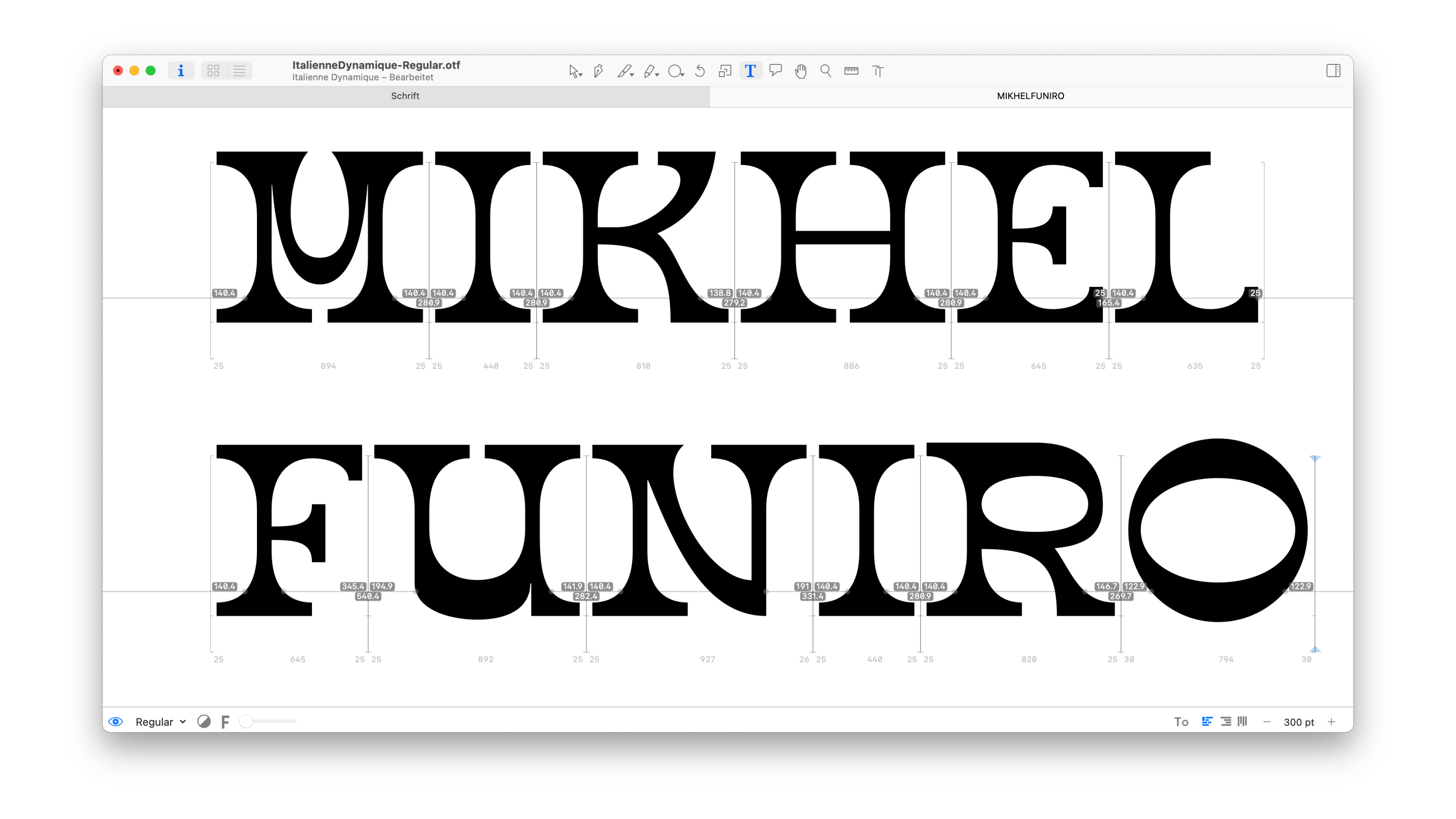
Italienne Dynamique (wip) is a reverse stress font with round proportions and strong serifs. Paired with a French Antiqua asthetic, the font comes with a strong bipolar personality. It is a decorative typeface designed for display sizes on digital and printed matter. In the 19th century the Italian was criticized as a typographic monstrosity, freak type or even degenerate idea of perversity. The aim of this project was to detach the typeface from its original wild west association and make it more modern, such as dynamic and supple, by implementing curved transitions.